Introducing…Schoolgirl Style’s “UNDER THE BOARDWALK” Classroom Collection! Out of all my creations, this particular classroom fits my personality and style more than anything I’ve ever done. I can’t even begin to tell you how much I adore this collection! As I styled this room, there were moments when I was just blown away by the […]

Introducing…Schoolgirl Style’s “UNDER THE BOARDWALK” Classroom Collection!

Out of all my creations, this particular classroom fits my personality and style more than anything I’ve ever done. I can’t even begin to tell you how much I adore this collection!

As I styled this room, there were moments when I was just blown away by the color combination and the absolute cuteness (is that even a word?) that this collection has to offer.

This collection give me pure joy, I tell you. PURE. JOY.
The color combination was inspired by something very simple…salt water taffy. Believe it or not, I have thought about this combination for YEARS and waited to create the perfect collection to showcase some of my very favorite colors. Lucky for me, I KNEW that now was the time. In fashion and decor, everything you see is orange. coral, pink, and teal. I decided to add some yellow and red (for contrast and from keeping it too pastel) to the combination.
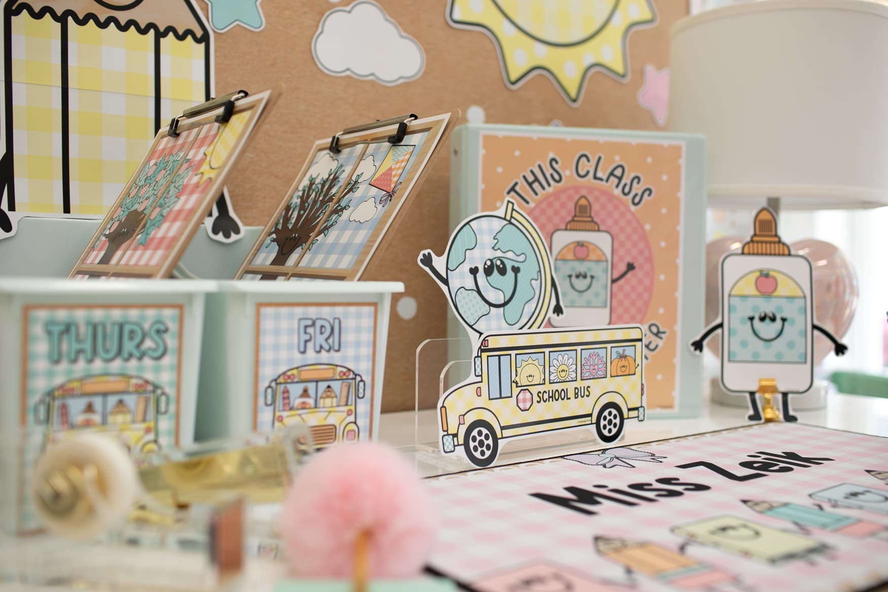
Using a variety of pattens (polka dots, chevron, stripes, and a paisley print) helped to build a classroom collection that feels happy, fun, and playful!

Lastly, I had one more thing in mind…vintage. I wanted the patterns to have an aged look, so my graphic designer spent hours perfecting this techique on my printables. I was giddy with excitement over the end result.
After we designed the collection, I decided to add just one more thing…the gorgeous lettering. We incorporated this pretty lettering throughout the collection… on banners, posters, the calender, and so much more.
I can’t wait for you to go through all of the photos and check out this stunning new collection!

I played around with several border ideas. Ultimately, I loved the orange ombre border paired with a sparkly coral. Hot pink and orange are one of the HOTTEST color combos this season and it looks fantastic together! *The alphabet line was taken to Office Depot to be enlarged. I asked the print technician to make the alphabet line 6 inches tall. I used a standard white paper to keep the cost down.

The striped storage bins are from The Land of Nod. I used these same bins in yesterday’s photo shoot as well. I just love the bold, bright stripes. I also noticed that Target has something similar in the Dollar Spot, but much smaller. I would run and grab these before they sell out!

I used TEAL bulletin board paper from Pacon as the background. This is one of my favorite colors and looks AMAZING with this collection!

Cover cans with our coordinating paper. This is a great way to incorporate more pattern and color into your design.

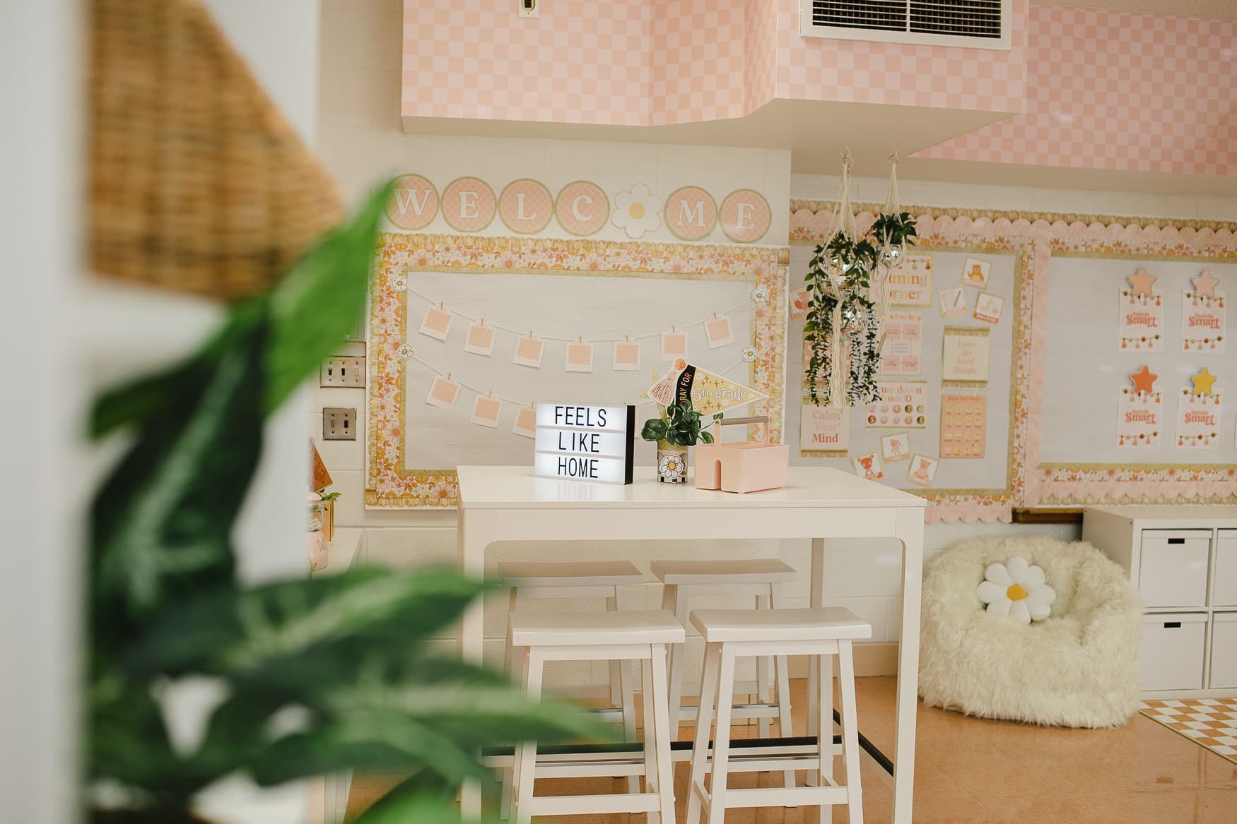
One of my favorite design ideas…use daisies in the corner of your bulletin boards! This will give you a big POP of color and also incorporate the paisley pattern throughout your room.


The cute, little cutouts on the whiteboard are included in the calendar set.

The rug is from Ikea. I believe it was only $19.99! I tried several rugs with this collection and kept coming back to this. I loved the large polka dots…another way to add big, bold patterns throughout your room!

Fonts used: KG Ray of Sunshine and Tuesday Script

I used the patterned circles included in the calendar file to create a polka dot background on my bulletin board paper. I love how this turned out!

Those binder covers…beautiful!

I chose to use pink bulletin board paper from Pacon on the other side of the room. I wanted to show you different color options with this collection. The pink is so so pretty.

I’m sure you can agree, this collection really does look like salt water taffy! The yellow polka dot border was a nice addition to the space. This collection is all about color and pattern, so add as many patterns as you would like…the more the better!

I pretty much died after I printed this calendar. I.LOVE.THIS.SO.MUCH. *I went to Office Depot and had each page enlarged to an 18×24. I used standard white paper to keep the price down. Laminate for durability.
The lettering, the colors, the patterns…ahhhh!!!!

I had so much fun shopping for desk accessories! The gold looks so so pretty with these colors!


This gorgeous gold foil print is from A Modern Teacher. You can puchase her prints here: http://amodernteacher.bigcartel.com/products


Target’s Pillowfort collection has bins, lamps, and rugs in coral, pink, and turquoise. It is SO easy to find coordinating classroom accessories for this collection!

DESIGN TIP! I used TEAL and PINK bulletin board paper from Pacon to use in my design, however, Pacon’s barnwood paper looks AMAZING with this collection too! If you are interested in a more “shabby” look, try using the barnwood paper, bushel baskets, and wood accents.

The alphabet line and the alphabet cards come in both cursive and manuscript fonts…

I used a variety of lantern colors…tangerine orange, aqua, yellow, coral, and orangesicle.


I also created these large banners to display your learning goals. I included several different types of wording to cover your district’s expectations. I also added several blank banners that you can edit yourself. Along with the banners, I also have individual subject headers to post in your room. Again, these are all editable, so feel free to add your own subjets and wording!
If you are a teacher that loves pattern and color, this is the collection for you!
I hope you enjoyed the tour!
“UNDER THE BOARDWALK” SHOPPING GUIDE
Fonts: Tuesday Script and KG Ray of Sunshine
To purchase “Under the Boardwalk” classroom decor package, visit the Schoolgirl Style Shop! Schoolgirl Style Shop – http://www.shopschoolgirlstyle.com
Tassels, lanterns, borders, washi tape, pink glitter clothespins, daisies on bulletin board: Schoolgirl Style Shop – http://www.shopschoolgirlstyle.com
Yellow, orange, and pink striped storage bins: The Land of Nod – http://www.landofnod.com
Desk accessories (lamp, gold stapler, gold scissors, gold jar, gumballs, polka dot journal, coral striped bins under desk, white cake stand): Target – http://www.target.com
Flowers: Michaels – http://www.michaels.com
Rug: Ikea – Orange Polka Dot Rug
Gold Foil Print: A Modern Teacher – Gold Foil Prints from A Modern Teacher
Bulletin board paper: Pacon – http://www.pacon.com
Photos: E.C. Campbell Photography in Clarkston, MI – http://www.eccampbellphotography.com
Share the Style!