Color psychology explores how different colors influence emotions, behavior, and focus. In the classroom, thoughtful color choices can help create an environment that supports calm, engagement, and effective learning.

What Is Color Psychology?
Color psychology is the study of how different colors affect human behavior and emotions. For example, people often associate red with energy, while blue tends to evoke feelings of calm and trust. These connections develop through a mix of biological, psychological, and cultural factors. In classroom settings, color is more than a design choice, it directly impacts how students feel, focus, and interact within the space.
How Do Colors Impact My Classroom and Students?
In a 2015 study examining the impact of classroom design, researchers analyzed 153 classrooms across 27 schools and identified three key factors that influence student learning: stimulation, individualization, and naturalness. Naturalness refers to environmental factors like lighting and temperature that directly support students’ physical comfort. Individualization focuses on how a classroom allows for flexibility, student ownership, and spaces that support different learning needs. Stimulation relates to the visual characteristics of a classroom like color and decor.
Colors can:
- Increase or decrease stress
- Improve concentration
- Stimulate creativity
- Influence behavior (calm vs. high energy)
The Different Types of Energy Each Color Brings
Calming Colors (Blue + Green)

Blue and green are often considered calming colors. Blue is associated with tranquility and stability, while green is linked to harmony and balance, making both colors effective choices for learning environments that aim to support focus and reduce stress.
Ideal for:
- Reading nooks
- Quiet zones
- Calming corners
- SEL areas
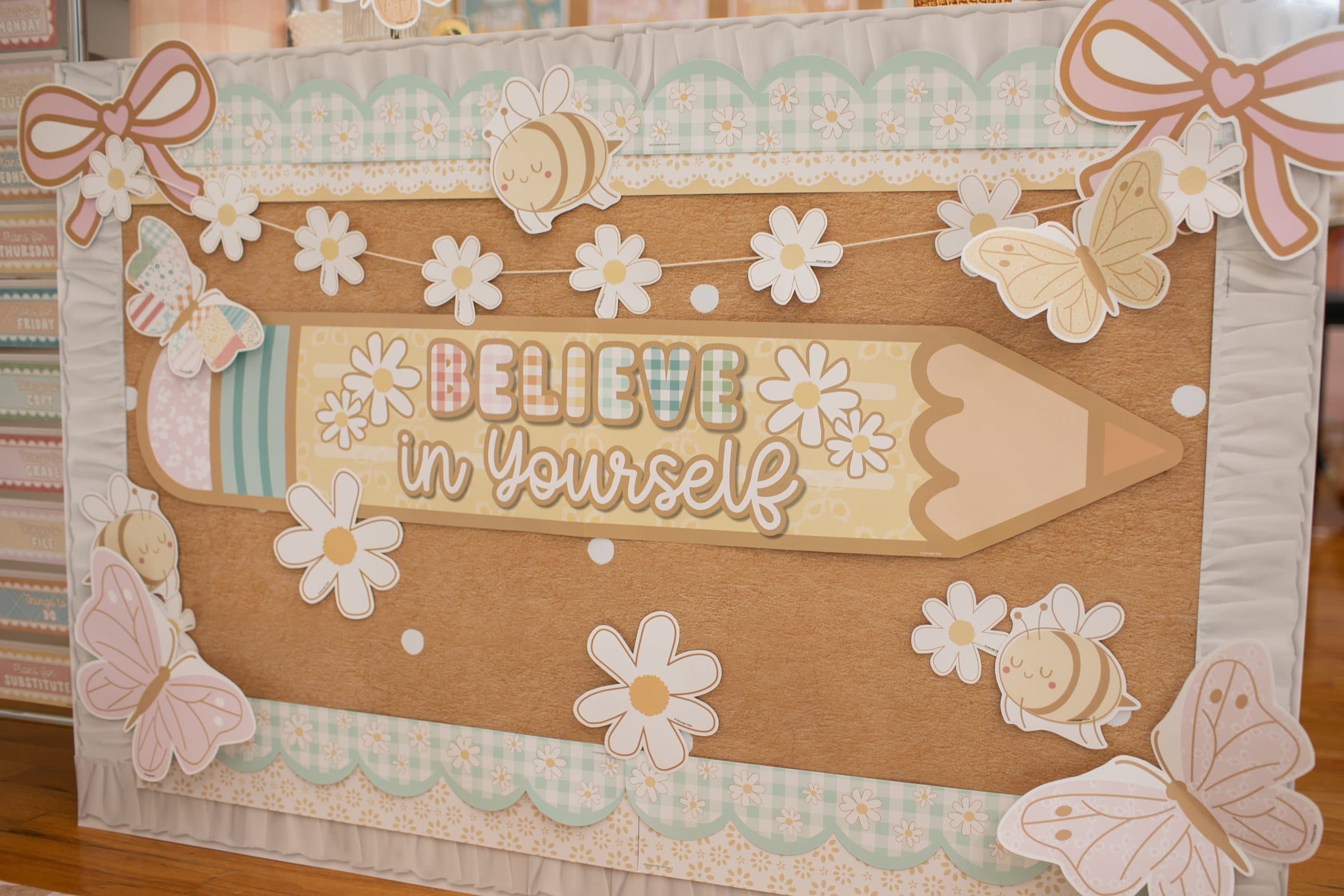
Stimulating Colors (Yellow + Red)

Warm colors like red and yellow are linked to energy and stimulation. Red can increase alertness and intensity, while yellow sparks creativity and optimism. Used strategically, these colors can boost engagement without overwhelming the classroom.
Implementation ideas:
- Wall accents
- Announcement boards
- Small pops in learning centers
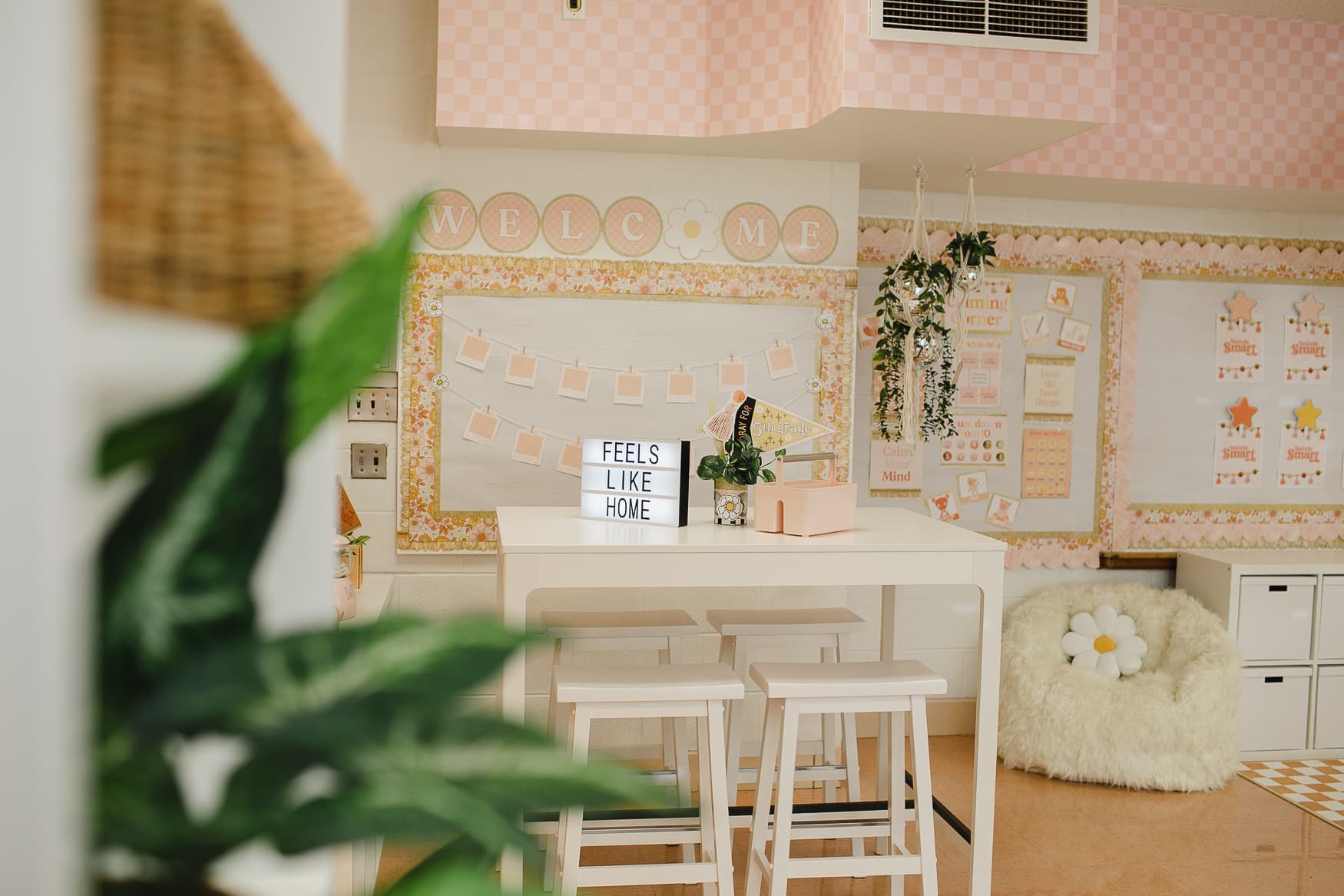
Neutrals (The Regulation Base)

Neutral classrooms can help regulate emotions. Neutral colors like white, beige, and gray create balance and calm in the classroom. They reduce visual distractions and provide a grounding backdrop that supports focus.
Neutrals support:
- Reduce visual noise
- Support neurodiverse learners
- Prevent sensory overload
- Allow student work to stand out
Creative & Collaborative Colors (Purple + Orange)

Purple and orange are vibrant colors that encourage creativity and curiosity. Purple can inspire imagination and problem solving, while orange promotes enthusiasm and playful energy. Used thoughtfully, these colors work well in areas for creative activities to make the classroom feel engaging and dynamic.
Great for:
- Art centers
- STEM zones
- Group areas
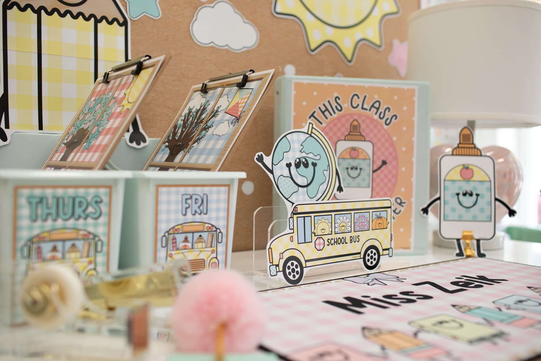
You can bring all these colors into your classroom with individual printable pieces, like posters, labels, and learning materials without needing to buy an entire collection!
Lighting and Temperature in the Classroom

Simple lighting adjustments can make a big difference in classroom comfort and focus. Using lamps with soft, warm light helps reduce their harshness. Turning off overhead fluorescent lights can create a calmer atmosphere during independent time too. These small changes support students’ well-being and make the learning environment more comfortable.
Sensory-Friendly & Neurodiversity

Colors can significantly impact students with sensory sensitivities or neurodiverse profiles. Lots of highly saturated colors may be overwhelming, increasing stress or distraction. Soft, muted tones like blues, greens, and warm neutrals tend to help emotional regulation.
- Avoid large amounts overstimulating combinations
- Use consistent color coding for organization and routines to support predictability.
- Incorporate natural textures and light to create a balanced, calming environment.
Discover even more ideas to support students’ social emotional growth by visiting Schoolgirl Style’s SEL section on our website!
How Can I Design With Intention?
- Start with a neutral base.
- Use cool tones for focus zones.
- Add warm tones in small, intentional areas.
- Match lighting temperature to your color palette.
- Reduce visual clutter before adding more color.
Intentional classroom design shapes how students feel, focus, and learn. Choosing colors, lighting, and sensory-friendly features with purpose supports engagement and comfort. Thoughtful design creates a classroom where every student thrives!
Explore all of Schoolgirl Style’s collections and find the perfect colors, decor, and tools to create a calm learning space!

FAQ: Color Psychology and Creating a Calm Classroom
1. How do colors impact student learning?
Colors influence mood, focus, and engagement. Cool colors like blue and green promote calm and concentration, while warm colors like red and yellow can stimulate energy and alertness.
2. What is the best way to use neutral colors?
Neutrals like beige, gray, and white create balance and reduce visual distractions. They provide a calming backdrop that complements both stimulating and calming colors in the classroom.
3. How can lighting and temperature support learning?
Soft, natural, or filtered lighting and comfortable temperatures help students stay focused and reduce stress. Turning off harsh fluorescent lights or adding desk lamps can make the classroom feel calmer and more welcoming.
4. What does sensory-friendly design involve?
Sensory-friendly design supports neurodiverse and sensitive learners. It includes quiet corners, soft lighting, neutral or calming colors, and flexible seating to reduce overstimulation and promote engagement.
5. How can I design my classroom intentionally?
Every element colors, lighting, temperature, layout, and sensory accommodations affects learning and well-being. By making purposeful choices, you can create a classroom where students feel supported and ready to thrive.
Last updated: 3/9/26
Share the Style!